
DESIGN & ACCESSIBILITY: SaaS FOR LOCUM PHYSICIANS
DESIGN & ACCESSIBILITY: SaaS FOR LOCUM PHYSICIANS
DESIGN & ACCESSIBILITY: SaaS FOR LOCUM PHYSICIANS
How might we improve visual design & navigation of a web app for medical professionals?
How might we improve visual design & navigation of a web app for medical professionals?
How might we improve visual design & navigation of a web app for medical professionals?
BRIEF
BRIEF
BRIEF

LOCVM (an online platform made for medical practitioners to find temporary job opportunities called locums) wanted to improve their SaaS Web App by updating visual design to better suit their content expansion.
LOCVM (an online platform made for medical practitioners to find temporary job opportunities called locums) wanted to improve their SaaS Web App by updating visual design to better suit their content expansion.
LOCVM (an online platform made for medical practitioners to find temporary job opportunities called locums) wanted to improve their SaaS Web App by updating visual design to better suit their content expansion.
My Role
My Role
My Role
UI/UX design
Accessibility audit
UX research (user interviews)
UI/UX design
Accessibility audit
UX research (user interviews)
UI/UX design
Accessibility audit
UX research (user interviews)
Deliverables
Deliverables
Deliverables
Two created website pages:
Guide to Occupational Medicine
Style guide updated for accessibility compliance
Two created website pages:
Guide to Occupational Medicine
Style guide updated for accessibility compliance
Two created website pages:
Guide to Occupational Medicine
Style guide updated for accessibility compliance
Tools Used
Tools Used
Tools Used
Figma & Vercel
(for design creation and functionality control)
WAVE Chrome extension & screen-readers
Figma & Vercel (for design creation and functionality control)
WAVE Chrome extension & screen-readers
Figma & Vercel
(for design creation and functionality control)
WAVE Chrome extension & screen-readers
By conducting visual design analysis, I needed to create pages that, despite being text-heavy, are still optimized for:
By conducting visual design analysis, I needed to create pages that, despite being text-heavy, are still optimized for:
By conducting visual design analysis, I needed to create pages that, despite being text-heavy, are still optimized for:
Clarity of navigation
Clarity of navigation
Clarity of navigation
Making complex information easy to parse for practitioners with busy schedules
Making complex information easy to parse for practitioners with busy schedules
Making complex information easy to parse for practitioners with busy schedules
Accessibility
Accessibility
Accessibility
Adaptable for different levels of reading and visual perception needs
Adaptable for different levels of reading and visual perception needs
Adaptable for different levels of reading and visual perception needs
User engagement
User engagement
User engagement
To attract new users and invite old ones to engage with the platform in more depth
To attract new users and invite old ones to engage with the platform in more depth
To attract new users and invite old ones to engage with the platform in more depth
ACCESSIBILITY AUDIT
ACCESSIBILITY AUDIT
ACCESSIBILITY AUDIT
Platform Assessment
Platform Assessment
Platform Assessment
As LOCVM aimed to improve not only content presentation, but also overall accessibility of the platform, I conducted a thorough analysis.
Using WAVE Chrome extension with screen-readers and keyboard navigation assessment, the aim was to better understand how users with visual or cognitive impairments might navigate the platform. Some of the main pain points identified were:
Visual Contrast
Visual Contrast
Visual Contrast
Lacking balance between background and foreground colors that might impact legibility of text and visual icons
Lacking balance between background and foreground colors that might impact legibility of text and visual icons
Lacking balance between background and foreground colors that might impact legibility of text and visual icons


Readability
Readability
Readability
Small text sizing, large paragraphs and lacking contrast that make textual information harder to navigate
Small text sizing, large paragraphs and lacking contrast that make textual information harder to navigate
Small text sizing, large paragraphs and lacking contrast that make textual information harder to navigate

Automated Presentation
Automated Presentation
Automated Presentation
Automatic functions, such as carousels, that might limit access for those relying on keyboard navigation
Automatic functions, such as carousels, that might limit access for those relying on keyboard navigation
Automatic functions, such as carousels, that might limit access for those relying on keyboard navigation

WEBSITE RE-DESIGN
WEBSITE RE-DESIGN
WEBSITE RE-DESIGN
Understanding the Problem Space
Understanding the Problem Space
Understanding the Problem Space
LOCVM wanted the design to be based on their newbie guides page but with new content that would provide templates of hiring contracts.
LOCVM wanted the design to be based on their newbie guides page but with new content that would provide templates of hiring contracts.
LOCVM wanted the design to be based on their newbie guides page but with new content that would provide templates of hiring contracts.
As they were beginning to expand their services, they needed a page that would support multiple documents while keeping the page easy to navigate.
As they were beginning to expand their services, they needed a page that would support multiple documents while keeping the page easy to navigate.
As they were beginning to expand their services, they needed a page that would support multiple documents while keeping the page easy to navigate.
My initial step was to identify key issues and opportunities within the existing page design. This way, I create clear goals that allow my future design process to be specific and strategic.
My initial step was to identify key issues and opportunities within the existing page design. This way, I create clear goals that allow my future design process to be specific and strategic.
My initial step was to identify key issues and opportunities within the existing page design. This way, I create clear goals that allow my future design process to be specific and strategic.

Opportunities
Opportunities
Opportunities
Clear and concise Call-To-Action
Well-established product descriptions and visual examples
Clear and concise Call-To-Action
Well-established product descriptions and visual examples
Clear and concise Call-To-Action
Well-established product descriptions and visual examples
Threats
Threats
Threats
Lack of clear informational hierarchy
Restrictive layout that leaves no room for growth (as more materials would need to be added)
Lack of clear informational hierarchy
Restrictive layout that leaves no room for growth (as more materials would need to be added)
Lack of clear informational hierarchy
Restrictive layout that leaves no room for growth (as more materials would need to be added)
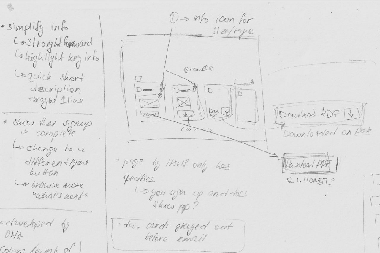
Sketches to Wireframes
Sketches to Wireframes
Sketches to Wireframes
Using the identified pain and gain points as guiding principles, I began sketching out possible solutions and alternatives, keeping the goal of making the page adaptable yet easy to navigate in mind.
Using the identified pain and gain points as guiding principles, I began sketching out possible solutions and alternatives, keeping the goal of making the page adaptable yet easy to navigate in mind.
Using sketches to plan out the flow
Using sketches to plan out the flow
Using sketches to plan out the flow
I began visualizing the relation between individual page elements and their impact on the navigation process:
What’s possible considering the company needs?
Where do interactive elements (buttons, cards, etc.) belong?
How do we connect them into a linear network?
I began visualizing the relation between individual page elements and their impact on the navigation process:
What’s possible considering the company needs?
Where do interactive elements (buttons, cards, etc.) belong?
How do we connect them into a linear network?
I began visualizing the relation between individual page elements and their impact on the navigation process:
What’s possible considering the company needs?
Where do interactive elements (buttons, cards, etc.) belong?
How do we connect them into a linear network?


Moving to wireframes to begin prototyping interactions
Moving to wireframes to begin prototyping interactions
Moving to wireframes to begin prototyping interactions
Identify best points of connection between interactive elements and screens:
Do the same interactions still make sense in the digital space?
What existing space & size requirements are we working with?
What assets can be reused and what needs to be created?
Identify best points of connection between interactive elements and screens:
Do the same interactions still make sense in the digital space?
What existing space & size requirements are we working with?
What assets can be reused and what needs to be created?
Identify best points of connection between interactive elements and screens:
Do the same interactions still make sense in the digital space?
What existing space & size requirements are we working with?
What assets can be reused and what needs to be created?


Mobile layouts developed alongside desktop
Mobile layouts developed alongside desktop
Mobile layouts developed alongside desktop
To ensure truly seamless navigation, I worked on mobile and desktop designs simultaneously, in order to ensure that the same functionality and visual language would work for both.
To ensure truly seamless navigation, I worked on mobile and desktop designs simultaneously, in order to ensure that the same functionality and visual language would work for both.
To ensure truly seamless navigation, I worked on mobile and desktop designs simultaneously, in order to ensure that the same functionality and visual language would work for both.


FINAL OUTCOMES
FINAL OUTCOMES
FINAL OUTCOMES
Function Breakdown
Function Breakdown
Function Breakdown
In conversation with the design and dev team leads, we picked individual elements that together would suit the key goal of easy navigation best:
Simple & Direct Product Summary
Simple & Direct Product Summary
Simple & Direct Product Summary
With key features highlighted on the left and direct instructions for access on the right
With key features highlighted on the left and direct instructions for access on the right
With key features highlighted on the left and direct instructions for access on the right

Clear & Connected CTA
Clear & Connected CTA
Clear & Connected CTA
Instant access to the provided files and call to explore further, all in the same place
Instant access to the provided files and call to explore further, all in the same place
Instant access to the provided files and call to explore further, all in the same place

Preview for a Quick Glance-Through
Preview for a Quick Glance-Through
Preview for a Quick Glance-Through
Overview of featured resources with visual preview, to simplify cognitive load and make information more approachable
Overview of featured resources with visual preview, to simplify cognitive load and make information more approachable
Overview of featured resources with visual preview, to simplify cognitive load and make information more approachable

Optional Details
Optional Details
Optional Details
Details of file size and format separated from descriptions, and option to select files individually or together - for easier navigation
Details of file size and format separated from descriptions, and option to select files individually or together - for easier navigation

Final Screens
Final Screens
Final Screens
Explore the complete screens presented below for both desktop and mobile designs.
Click on any of the images for a closer look or checkout the webpage in action!
Explore the complete screens presented below for both desktop and mobile designs.
Click on any of the images for a closer look or checkout the webpage in action!
Explore the complete screens presented below for both desktop and mobile designs.
Click on any of the images for a closer look or checkout the webpage in action!
Pre Sign-Up: Highlighted overview of what’s included & preview of provided content
Pre Sign-Up: Highlighted overview of what’s included & preview of provided content
Pre Sign-Up: Highlighted overview of what’s included & preview of provided content


Post Sign-Up: Using color for guidance & quick download features to enhance navigation
Post Sign-Up: Using color for guidance & quick download features to enhance navigation
Post Sign-Up: Using color for guidance & quick download features to enhance navigation


STYLE GUIDE RE-DESIGN
STYLE GUIDE RE-DESIGN
STYLE GUIDE RE-DESIGN
As there was a line of accessibility issues that came out in the initial platform assessment, I also updated the existing style guide, focusing on:
As there was a line of accessibility issues that came out in the initial platform assessment, I also updated the existing style guide, focusing on:
As there was a line of accessibility issues that came out in the initial platform assessment, I also updated the existing style guide, focusing on:
Updating components to match accessibility recommendations
Creating new layout styles for consistent use between desktop and mobile breakpoints
Adding usability rules to streamline the process for other designers and developers on the team
Updating components to match accessibility recommendations
Creating new layout styles for consistent use between desktop and mobile breakpoints
Adding usability rules to streamline the process for other designers and developers on the team
Updating components to match accessibility recommendations
Creating new layout styles for consistent use between desktop and mobile breakpoints
Adding usability rules to streamline the process for other designers and developers on the team
View a sample of the style guide below
View a sample of the style guide below

Summary
Summary
Summary
Based on structured assessment of existing design systems, I have updated and improved the featured pages within the LOCVM website platform, focusing on:
Based on structured assessment of existing design systems, I have updated and improved the featured pages within the LOCVM website platform, focusing on:
Based on structured assessment of existing design systems, I have updated and improved the featured pages within the LOCVM website platform, focusing on:
Clarity of navigation
Clarity of navigation
Making complex information easy to parse for practitioners with busy schedules
Making complex information easy to parse for practitioners with busy schedules
Accessibility
Accessibility
Adaptability for different levels of reading and visual perception needs
Adaptability for different levels of reading and visual perception needs
User engagement
User engagement
To attract new users and invite old ones to engage with the platform in more depth
To attract new users and invite old ones to engage with the platform in more depth
Clarity of navigation
Making complex information easy to parse for practitioners with busy schedules
Accessibility
Adaptability for different levels of reading and visual perception needs
User engagement
To attract new users and invite old ones to engage with the platform in more depth


